组合图表
我们将创建一个图表,同时展示身高(用折线图表示)和体重(用柱状图表示),以直观地对比两种数据。
swift
import Charts
import SwiftUI

struct Person1: Identifiable {
    let id = UUID()
    let name: String
    let height: Double
    let weight: Double
}

struct CombineView: View {
    let people = [
        Person1(name: "Alice", height: 165, weight: 55),
        Person1(name: "Bob", height: 180, weight: 75),
        Person1(name: "Charlie1", height: 172, weight: 68),
        Person1(name: "Charlie", height: 172, weight: 68)
    ]

    var body: some View {
        Chart(people) { person in
            // 身高 - 折线图
            LineMark(
                x: .value("Name", person.name),
                y: .value("Height (cm)", person.height)
            )
            .foregroundStyle(.blue)
            .symbol(.circle)

            // 体重 - 柱状图
            BarMark(
                x: .value("Name", person.name),
                y: .value("Weight (kg)", person.weight)
            )
            .foregroundStyle(.red.opacity(0.5))
        }
        .chartYAxisLabel("Value")
        .chartXAxisLabel("Names")
        .chartLegend(.visible) // 显示图例,区分身高和体重
        .chartYScale(domain: 0 ... 200) // 设置纵轴范围,适应两种数据
        .frame(height: 300)
        .padding()
    }
}
import Charts
import SwiftUI
struct Person1: Identifiable {
let id = UUID()
let name: String
let height: Double
let weight: Double
}
struct CombineView: View {
let people = [
Person1(name: "Alice", height: 165, weight: 55),
Person1(name: "Bob", height: 180, weight: 75),
Person1(name: "Charlie1", height: 172, weight: 68),
Person1(name: "Charlie", height: 172, weight: 68)
]
var body: some View {
Chart(people) { person in
// 身高 - 折线图
LineMark(
x: .value("Name", person.name),
y: .value("Height (cm)", person.height)
)
.foregroundStyle(.blue)
.symbol(.circle)
// 体重 - 柱状图
BarMark(
x: .value("Name", person.name),
y: .value("Weight (kg)", person.weight)
)
.foregroundStyle(.red.opacity(0.5))
}
.chartYAxisLabel("Value")
.chartXAxisLabel("Names")
.chartLegend(.visible) // 显示图例,区分身高和体重
.chartYScale(domain: 0 ... 200) // 设置纵轴范围,适应两种数据
.frame(height: 300)
.padding()
}
}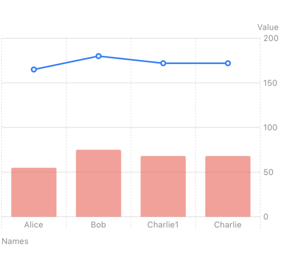
代码解释
- 两种数据标记:
LineMark用于身高数据,BarMark用于体重数据,分别用蓝色和红色(半透明)区分。 - 纵轴范围:
.chartYScale(domain: 0...200)确保身高和体重数据都能在图表中完整显示。
步骤 2:动态数据更新
我们将使用 @State 管理数据,并在用户交互(比如点击按钮)时更新数据,模拟实时变化。
swift
import SwiftUI
import Charts

struct Person: Identifiable {
    let id = UUID()
    let name: String
    let height: Double
    let weight: Double
}

struct ContentView: View {
    @State private var people = [
        Person(name: "Alice", height: 165, weight: 55),
        Person(name: "Bob", height: 180, weight: 75),
        Person(name: "Charlie", height: 172, weight: 68)
    ]

    var body: some View {
        VStack {
            Chart(people) { person in
                LineMark(
                    x: .value("Name", person.name),
                    y: .value("Height (cm)", person.height)
                )
                .foregroundStyle(.blue)
                .symbol(.circle)

                BarMark(
                    x: .value("Name", person.name),
                    y: .value("Weight (kg)", person.weight)
                )
                .foregroundStyle(.red.opacity(0.5))
            }
            .chartYAxisLabel("Value")
            .chartXAxisLabel("Names")
            .chartLegend(.visible)
            .chartYScale(domain: 0...200)
            .frame(height: 300)
            .padding()

            Button(action: {
                // 模拟数据更新:增加每个人的身高和体重
                people = people.map { person in
                    Person(name: person.name,
                           height: person.height + Double.random(in: 1...5),
                           weight: person.weight + Double.random(in: 1...3))
                }
            }) {
                Text("Update Data")
                    .font(.headline)
                    .padding()
                    .background(.blue)
                    .foregroundColor(.white)
                    .cornerRadius(10)
            }
        }
    }
}

struct ContentView_Previews: PreviewProvider {
    static var previews: some View {
        ContentView()
    }
}
import SwiftUI
import Charts
struct Person: Identifiable {
let id = UUID()
let name: String
let height: Double
let weight: Double
}
struct ContentView: View {
@State private var people = [
Person(name: "Alice", height: 165, weight: 55),
Person(name: "Bob", height: 180, weight: 75),
Person(name: "Charlie", height: 172, weight: 68)
]
var body: some View {
VStack {
Chart(people) { person in
LineMark(
x: .value("Name", person.name),
y: .value("Height (cm)", person.height)
)
.foregroundStyle(.blue)
.symbol(.circle)
BarMark(
x: .value("Name", person.name),
y: .value("Weight (kg)", person.weight)
)
.foregroundStyle(.red.opacity(0.5))
}
.chartYAxisLabel("Value")
.chartXAxisLabel("Names")
.chartLegend(.visible)
.chartYScale(domain: 0...200)
.frame(height: 300)
.padding()
Button(action: {
// 模拟数据更新:增加每个人的身高和体重
people = people.map { person in
Person(name: person.name,
height: person.height + Double.random(in: 1...5),
weight: person.weight + Double.random(in: 1...3))
}
}) {
Text("Update Data")
.font(.headline)
.padding()
.background(.blue)
.foregroundColor(.white)
.cornerRadius(10)
}
}
}
}
struct ContentView_Previews: PreviewProvider {
static var previews: some View {
ContentView()
}
}步骤 3:动画效果
SwiftUI Charts 支持动画效果,我们可以在数据更新时添加平滑过渡。
swift
.animation(.easeInOut(duration: 0.5), value: people).animation(.easeInOut(duration: 0.5), value: people)示例-两个折线图并存的场景
swift
import Charts
import SwiftUI

struct StepCount: Identifiable {
    let id = UUID()
    let weekday: Date
    let steps: Int

    init(day: String, steps: Int) {
        let formatter = DateFormatter()
        formatter.dateFormat = "yyyyMMdd"

        self.weekday = formatter.date(from: day) ?? Date.distantPast
        self.steps = steps
    }

    var shortDay: String {
        let dateFormatter = DateFormatter()
        dateFormatter.dateFormat = "EEE"
        return dateFormatter.string(from: weekday)
    }
}

struct LineCharts: View {
    let currentWeek = [
        StepCount(day: "20220710", steps: 15800),
        StepCount(day: "20220711", steps: 7300),
        StepCount(day: "20220712", steps: 8200),
        StepCount(day: "20220713", steps: 25600),
        StepCount(day: "20220714", steps: 16100),
        StepCount(day: "20220715", steps: 16500),
        StepCount(day: "20220716", steps: 3200)
    ]

    let currentWeek2 = [
        StepCount(day: "20220717", steps: 4200),
        StepCount(day: "20220718", steps: 15000),
        StepCount(day: "20220719", steps: 2800),
        StepCount(day: "20220720", steps: 10800)
    ]

    var body: some View {
        GroupBox("Line Chart - Step Count") {
            Chart {
                ForEach(currentWeek) {
                    LineMark(
                        x: .value("Week Day", $0.shortDay),
                        y: .value("Step Count", $0.steps)
                    )
                    .symbol(.circle)
                    .foregroundStyle(by: .value("Week", "GeGe"))
                }

                ForEach(currentWeek2) {
                    LineMark(
                        x: .value("Week Day", $0.shortDay),
                        y: .value("Step Count", $0.steps)
                    )
                    .symbol(.circle)
                    .foregroundStyle(by: .value("Week", "RED"))
                }
            }.frame(height: 200)
        }
    }
}

#Preview {
    LineCharts()
}
import Charts
import SwiftUI
struct StepCount: Identifiable {
let id = UUID()
let weekday: Date
let steps: Int
init(day: String, steps: Int) {
let formatter = DateFormatter()
formatter.dateFormat = "yyyyMMdd"
self.weekday = formatter.date(from: day) ?? Date.distantPast
self.steps = steps
}
var shortDay: String {
let dateFormatter = DateFormatter()
dateFormatter.dateFormat = "EEE"
return dateFormatter.string(from: weekday)
}
}
struct LineCharts: View {
let currentWeek = [
StepCount(day: "20220710", steps: 15800),
StepCount(day: "20220711", steps: 7300),
StepCount(day: "20220712", steps: 8200),
StepCount(day: "20220713", steps: 25600),
StepCount(day: "20220714", steps: 16100),
StepCount(day: "20220715", steps: 16500),
StepCount(day: "20220716", steps: 3200)
]
let currentWeek2 = [
StepCount(day: "20220717", steps: 4200),
StepCount(day: "20220718", steps: 15000),
StepCount(day: "20220719", steps: 2800),
StepCount(day: "20220720", steps: 10800)
]
var body: some View {
GroupBox("Line Chart - Step Count") {
Chart {
ForEach(currentWeek) {
LineMark(
x: .value("Week Day", $0.shortDay),
y: .value("Step Count", $0.steps)
)
.symbol(.circle)
.foregroundStyle(by: .value("Week", "GeGe"))
}
ForEach(currentWeek2) {
LineMark(
x: .value("Week Day", $0.shortDay),
y: .value("Step Count", $0.steps)
)
.symbol(.circle)
.foregroundStyle(by: .value("Week", "RED"))
}
}.frame(height: 200)
}
}
}
#Preview {
LineCharts()
}效果: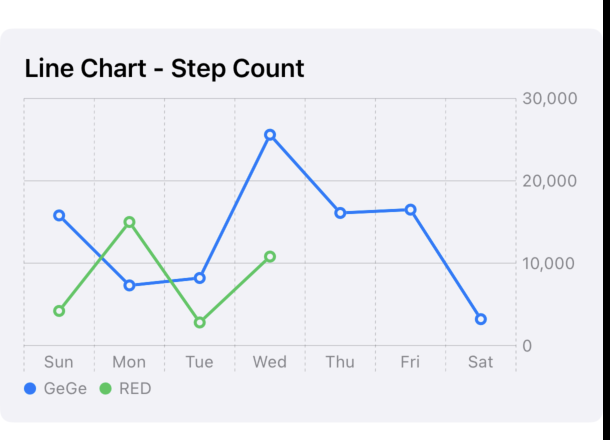
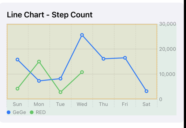
添加背景
关键字: chartPlotStyle 、chartBackground
swift
GroupBox("Line Chart - Step Count") {
            Chart {
                ForEach(currentWeek) {
                    LineMark(
                        x: .value("Week Day", $0.shortDay),
                        y: .value("Step Count", $0.steps)
                    )
                    .symbol(.circle)
                    .foregroundStyle(by: .value("Week", "GeGe"))
                }

                ForEach(currentWeek2) {
                    LineMark(
                        x: .value("Week Day", $0.shortDay),
                        y: .value("Step Count", $0.steps)
                    )
                    .symbol(.circle)
                    .foregroundStyle(by: .value("Week", "RED"))
                }
            }
            .frame(height: 200)
            .chartBackground { _ in
                Color.green.opacity(0.1)
            }
            .chartPlotStyle { plotArea in
                plotArea
                    .background(.orange.opacity(0.1))
                    .border(.orange.opacity(0.3), width: 2)
            }
}GroupBox("Line Chart - Step Count") {
Chart {
ForEach(currentWeek) {
LineMark(
x: .value("Week Day", $0.shortDay),
y: .value("Step Count", $0.steps)
)
.symbol(.circle)
.foregroundStyle(by: .value("Week", "GeGe"))
}
ForEach(currentWeek2) {
LineMark(
x: .value("Week Day", $0.shortDay),
y: .value("Step Count", $0.steps)
)
.symbol(.circle)
.foregroundStyle(by: .value("Week", "RED"))
}
}
.frame(height: 200)
.chartBackground { _ in
Color.green.opacity(0.1)
}
.chartPlotStyle { plotArea in
plotArea
.background(.orange.opacity(0.1))
.border(.orange.opacity(0.3), width: 2)
}
}效果如图:
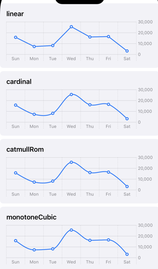
折线图 平滑曲线
关键词: .interpolationMethod(...)
SwiftUI Charts 中的 .interpolationMethod 接受 InterpolationMethod 枚举类型的值,目前支持以下几种常见的插值方法:
.linear(线性插值)- 数据点之间以直线连接。
- 这是最简单和默认的插值方法,适合用于表示数据之间的线性关系。
- 视觉效果:折线图呈现为折线,线条棱角分明。
.cardinal(基数样条插值)- 使用基数样条(Cardinal Spline)算法在数据点之间绘制平滑曲线。
- 这种方法会生成一条穿过数据点的平滑曲线,适合用于展示趋势而非精确值。
- 视觉效果:线条更圆滑,过渡自然。
- 可以通过参数
tension调整曲线的平滑度,值范围通常在 0 到 1 之间,值越小曲线越平滑。
.catmullRom(Catmull-Rom 样条插值)- 使用 Catmull-Rom 样条算法绘制平滑曲线。
- 这种插值方法也生成平滑曲线,并且保证曲线通过每个数据点,适合用于需要精确通过数据点的平滑图表。
- 视觉效果:与
.cardinal类似,但曲线的计算方式略有不同。 - 同样可以通过
alpha参数调整平滑度。
.monotoneCubic(单调三次插值)- 使用单调三次插值算法,确保曲线在数据点之间是单调的(即不会出现过大的波动或过冲)。
- 这种方法适合用于需要保持数据趋势单调性的场景(例如时间序列数据)。
- 视觉效果:曲线平滑且不会出现过冲现象。
.stepStart和.stepEnd(阶梯插值)- 数据点之间以阶梯状线条连接,类似于步进图。
.stepStart:从当前数据点的值开始绘制水平线到下一个点。.stepEnd:从当前数据点的值结束绘制水平线到下一个点。- 视觉效果:线条呈现为阶梯状,适合展示离散变化。

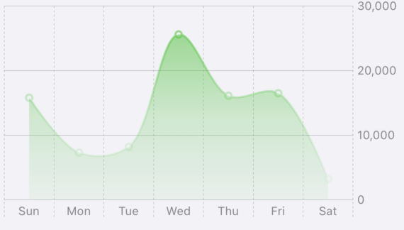
折线图和Area图相结合
折线图和Area图相结合,效果非常漂亮。
swift
    let currentWeek = [
        StepCount(day: "20220710", steps: 15800),
        StepCount(day: "20220711", steps: 7300),
        StepCount(day: "20220712", steps: 8200),
        StepCount(day: "20220713", steps: 25600),
        StepCount(day: "20220714", steps: 16100),
        StepCount(day: "20220715", steps: 16500),
        StepCount(day: "20220716", steps: 3200)
    ]
    let curColor = Color(hue: 0.33, saturation: 0.81, brightness: 0.76)
    let curGradient = LinearGradient(
        gradient: Gradient(
            colors: [
                Color(hue: 0.33, saturation: 0.81, brightness: 0.76).opacity(0.5),
                Color(hue: 0.33, saturation: 0.81, brightness: 0.76).opacity(0.2),
                Color(hue: 0.33, saturation: 0.81, brightness: 0.76).opacity(0.05)
            ]
        ),
        startPoint: .top,
        endPoint: .bottom
    )

Chart {
	ForEach(currentWeek) {
		LineMark(
			x: .value("Week Day", $0.shortDay),
			y: .value("Step Count", $0.steps)
		)
		.interpolationMethod(.catmullRom)
		.foregroundStyle(curGradient)
		.symbol(.circle)

		AreaMark(
			x: .value("Week Day", $0.shortDay),
			y: .value("Step Count", $0.steps)
		)
		.interpolationMethod(.catmullRom)
		.foregroundStyle(curGradient)
	}
}
其他扩展
如何横向滚动: 关键apichartScrollableAxes
如何实现tool tip: Chart Interaction using ChartOverlay in SwiftUI and Charts Framework 、chartXSelection API