变换在动画中有更好的性能。
基本变换
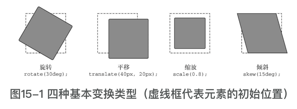
rotate
元素绕着一个轴心转动一定角
transform: rotate(15deg);transform: rotate(15deg);translate
元素向上、下、左、右各个方向移动(有点类似于相对定位)。
/*使元素向右移动20px,向下移动40px。同样,也可以使用负值使元素向相反的方向变换。*/
transform: translate(20px, 40px);
/*使元素向右移动20px,向下移动40px。同样,也可以使用负值使元素向相反的方向变换。*/
transform: translate(20px, 40px);scale
缩小或放大元素
skew
使元素变形,顶边滑向一个方向,底边滑向相反的方向。
transform: skew(20deg); 使卡片倾斜20度transform: skew(20deg); 使卡片倾斜20度多重变化
多个变换,可以用空格分割。
基准点
使用transform-origin更改基准点:
transform: rotate(15deg);
transform-origin: right center;
transform: rotate(15deg);
transform-origin: right center;额外的,transform-origin 也支持百分比。
浏览器如何渲染页面
布局: 浏览器计算每个元素在屏幕占多大空间。任何时候改变一个元素的宽度或高度,或者调整位置属性(比如top或者left),元素的布局都会重新计算。如果使用JavaScript在DOM中插入或者移除元素,也会重新计算布局。一旦布局发生改变,浏览器就必须重排(reflow)页面,重新计算所有其他被移动或者缩放的元素的布局。
绘制: 这个过程就是填充像素:描绘文本,着色图片、边框和阴影。这不会真正显示在屏幕上,而是在内存中绘制。页面各部分生成了很多的图层(layers)。如果改变某个元素的背景颜色,就必须重新绘制它。但因为更改背景颜色不会影响到页面上任何元素的位置和大小,所以这种变化不需要重新计算布局。改变背景颜色比改变元素大小需要的计算操作要少。
合成。在合成(composite)阶段,浏览器收集所有绘制完成的图层,并把它们提取为最终显示在屏幕上的图像。opacity和transform这两个属性如果发生改变,需要的渲染时间就会非常少。。当我们修改元素的这两个属性之一时,浏览器就会把元素提升到其自己的绘制图层并使用GPU加速。因为元素存在于自己的图层,所以整个图像变化过程中主图层将不会发生变化,也无须重复的重绘。
will-change
- will-change为web 开发者提供了一种告知浏览器该元素会有哪些变化的方法,这样浏览器可以在元素属性真正发生变化之前提前做好对应的优化准备工作。这种优化可以将一部分复杂的计算工作提前准备好,使页面的反应更为快速灵敏。
- 不要滥用
三维变换
perspective
为页面添加3D变换之前,我们需要先确定一件事情,即透视距离(perspective)。变换后的元素一起构成了一个3D场景。接着浏览器会计算这个3D场景的2D图像,并渲染到屏幕上。我们可以把透视距离想象成“摄像机”和场景之间的距离,前后移动镜头就会改变整个场景最终显示到图像上的方式。
如果镜头比较近(即透视距离小),那么3D效果就会比较强。如果镜头比较远(即透视距离大),那么3D效果就会比较弱。
transform: perspective(200px) rotateX(40deg); transform: perspective(200px) rotateX(40deg);perspective-origin
透视距离的渲染是假设观察者(或者镜头)位于元素中心的正前方。perspective-origin属性可以上下、左右移动镜头的位置。
我们可以使用关键字top、left、bottom、right和center来指定位置,也可以使用百分比或者长度值,从元素的左上角开始计算(比如perspective-origin: 25% 25%)。
例如:我们将镜头移入到左下角。
  transform: perspective(200px) rotateX(40deg);
  transform-origin: left bottom; // 镜头移动到左下角
transform: perspective(200px) rotateX(40deg);
transform-origin: left bottom; // 镜头移动到左下角backface-visibility
些有趣的事情:元素的“脸”不再直接朝向你。它的“脸”转向别的地方,你会看到元素的背面:
transform: rotateY(180deg); transform: rotateY(180deg);如果需要让元素背面的时候不可见,可以设置为:
backface-visibility:hiddenbackface-visibility:hiddentransform-style(preserve-3d)属性
如果对3D变换元素的父元素再做3D变换,可能需要用到preserve-3d属性